Small Changes, Big Gains:
How One CRO Test Delivered a 2% Conversion Lift and 1% Revenue Growth for Nando’s

Sector
Restaurant
Our role
- Conversion Rate Optimisation,
Nando's
With 350 restaurants across the UK, Nando’s is one of the giants of the British High Street.
Over the last five years we’ve been helping them bring the phenomenal success of their offline experience into their ever-expanding online channels.
With significant investments in both internal and external teams, they knew the importance of conversion rate optimisation (CRO) in being able to scientifically improve the experience for their customers. However, they also knew that branching into this area would require the support of a dedicated, expert team to guide them.
Through close collaboration with the Ecommerce team from the outset, upskilling and developing them has been an integral part of our relationship.
Within their first three months with us, they’d already generated enough additional online revenue to pay for our services for the year 7 times over!

Challenge
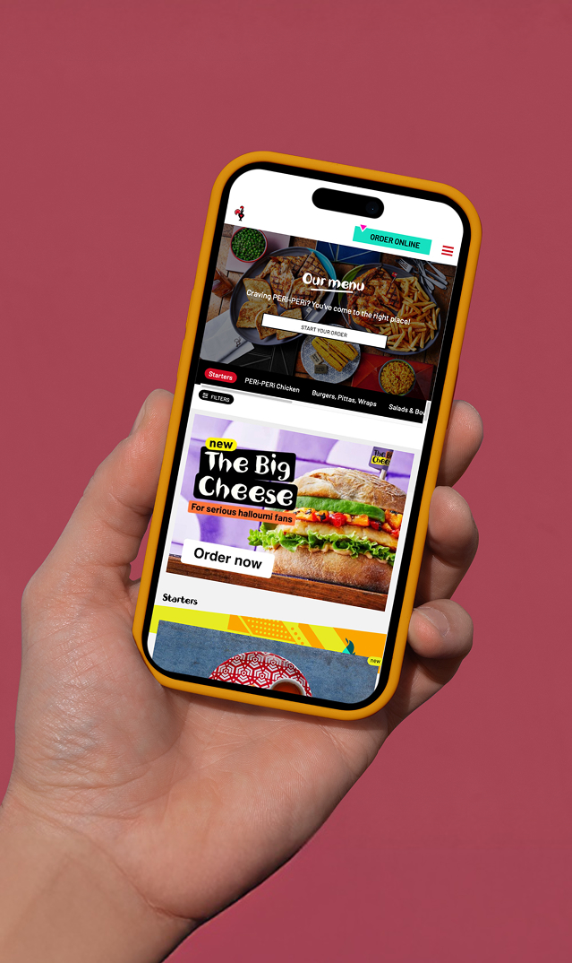
A cumbersome mobile navigation
Internal user testing showed visitors were struggling to navigate the order platform and were having to think about where to go rather than it being intuitive.
One issue highlighted was that navigating through the menu and submenus was difficult as it wasn’t obvious how to do it. The menu bar was inconsistent across the site as it disappeared on the menu pages and the back link was awkward to interact with on mobile due to the small size, as well as scrolling off the page as opposed to it being sticky.
Our challenge was to help overcome some of the difficulties and improve the navigation.
What we did
What seems to be the problem?
The navigation was both inconsistent & physically difficult to operate.
It would change depending on where the visitor was in the journey, and the touch area of the menu link itself was very small. On top of that, it was located in the diagonally opposite corner to most (right-handed) visitors’ thumbs. And that made it even more frustrating to use.
Introducing a horizontal scroll menu
We conducted an experiment where an in-menu navigation bar was introduced to reduce the friction involved in navigation. This option allowed visitors to click the navigation bar to move directly to their desired location, rather than continuously scrolling down the menu, or clicking back before they could move forward. It also presented the opportunity to bring sub-category pages into the primary navigation.
A couple of different designs were considered to enhance the aesthetics of the menu in combination with the broad hypothesis. However, to maintain a consistent experience, the navigation design tested stayed with Nando’s primary brand colours and styling that were used across the rest of the order platform.
Test Hypothesis
BY
introducing sub-category pages into the primary navigation
VISITORS WILL
find it easier to navigate through the menu
THEREBY
increasing the percentage of visitors who complete an order
What happened?
Navigation usage increased…
…but revenue decreased by 1.42%.
We observed an increase in clicks on navigation which resulted in less overall browsing of different subsections. Visitors browsed less which caused a decrease in the amount people were buying. This suggests a certain degree of impulse buying happening previously.
We assumed that the test would win, and our hypothesis was based on user data that supported this!
Internally, it was the preferred approach and would have been rolled out without testing without our input.
Visitors said one thing but did another!
And this is the cost of not testing!
The new navigation would have caused a decrease in revenue & without keeping a Control group, we would never have known.
Test, Learn and iterate
Both the Control & our original experiment had one thing in common – they utilised non-standard UI elements.
And whilst “standard” elements might be considered boring, they are instantly recognisable. And instant recognition means instant usability.
Introducing a burger menu
This iteration was based on a combination of our ideas and some internal design work Nando’s had been contemplating.
We could use testing to support what other internal teams were considering.
The horizontal navigation was refactored to be displayed as a hamburger menu that slid out.
Test Hypothesis
BY
introducing a burger menu navigation
VISITORS WILL
instantly recognise the UI element & therefore find it easier to navigate through the menu
THEREBY
increasing the percentage of visitors who complete an order
What happened?
Navigation usage increased…
…this time both conversion & revenue increased with it.
And this is the value of testing
Based on user research the business would have rolled out the new horizontal scroll style navigation without testing.
What visitors say they want isn’t always how they respond when it comes to voting with real money.
That’s why testing is so important – it validates business assumptions and reduces risk.
Even though the original test failed to produce a commercially-beneficial experience, it was still a win because it saved the business from implementing something that would have cost them money.
And by learning from that initial test, we found a way that worked for everyone.
+ 2 %
Conversion
+ 1 %
revenue
£ 21
ROI for each £1 invested
“These guys are superstars! I've been working with the team for almost 5 years now and they've played an integral part in building our test and learn capabilities and culture. They are highly knowledgeable and reliable across web AB testing and have become part of our work family.”
George Crofts, Senior Digital Commerce Manager
Nando's


Let’s make something great together.
Drop us a line.